
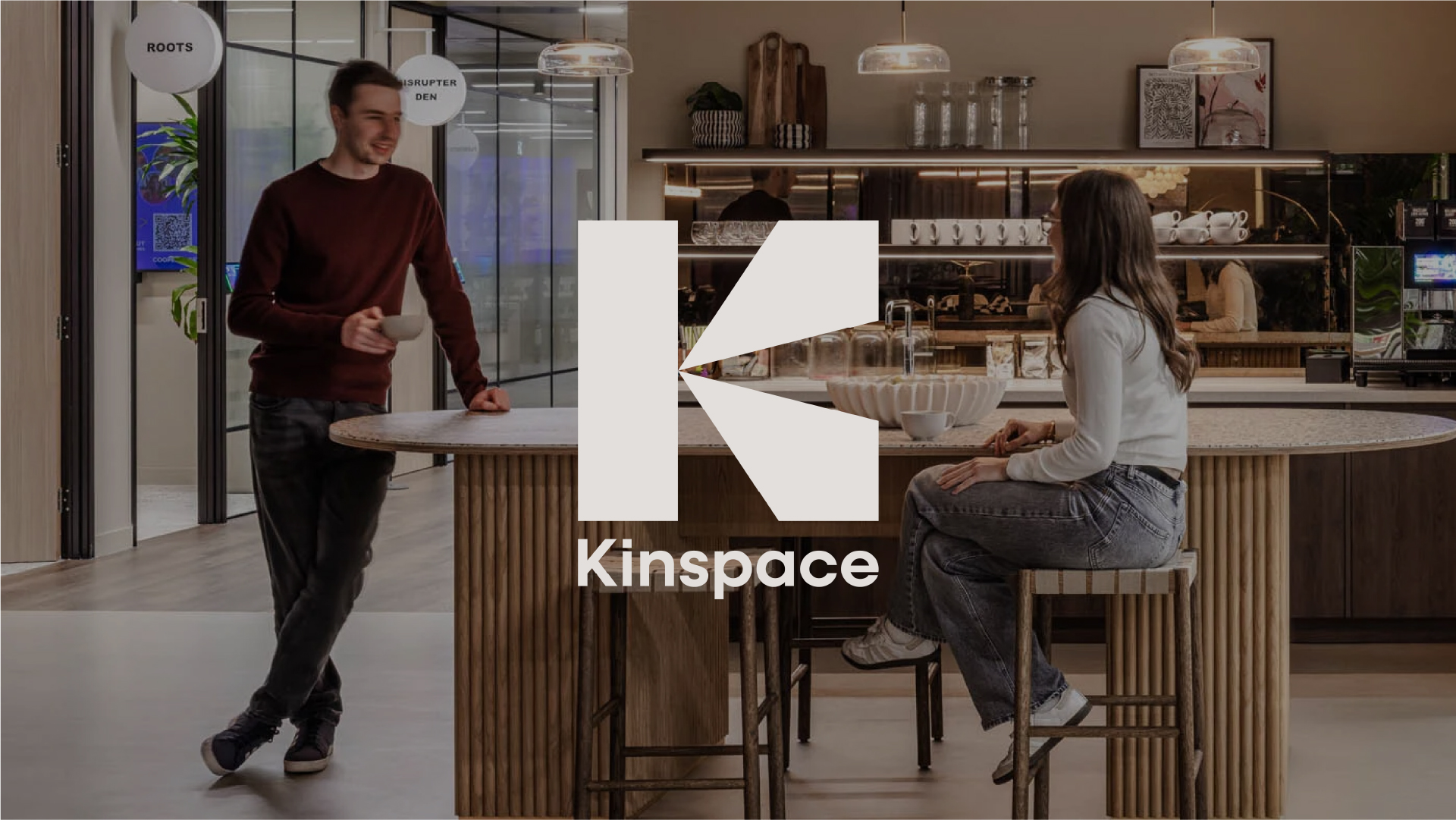
A modern and premium brand identity to launch a new chapter for Kinspace.
Branching off from Office Principles, Kinspace needed a brand to show they create meaningful environments built around people rather than just building workplaces. The challenge was to create a flexible identity that shifts the focus from structure to the individual, while working cohesively across diverse materials.
I created a flexible logo system, with a monogram ‘K’ at the center, inspired by the one-point perspective drawings central to workspace design. This acts as a literal lens to view the workplace, with its depth and dimension symbolising a commitment to seeing space from a human point of view. This is paired with a warm, authentic colour palette inspired by materials used within the spaces, while real-world photography highlights genuine moments of connection that their builds facilitate.


